
Magic The Gathering
It was time for change, both skin deep and behind the scenes.

Reasons for a redesign
A number of years ago, while Magic: The Gathering was enjoying unprecedented success, the official site was showing its age. It was also built on a bespoke CMS with a huge technical debt. New to Wizards of the Coast, I was tasked with the challenge of assessing the site’s structure, defining core goals and collaborating to synthesize a new experience.

Who & when
This effort was not, and could not be a solo effort. At Wizards of the Coast, Magic: The Gathering drives and affects nearly everyone. This project involved input from countless stakeholders and inspired passionate feedback from across the organization. There were several phases of development that culminated in a Phase II completion in December, 2014.
Where it was headed
While project goals included zones focused on business and technical efficiencies, most efforts and strategies were focused on serving the fans & players. These goals included creating an enjoyable experience, clarifying the intention of core site content, providing improved search and ensuring that time spent using the site was rewarding enough to warrant regular return visits.

Building blocks
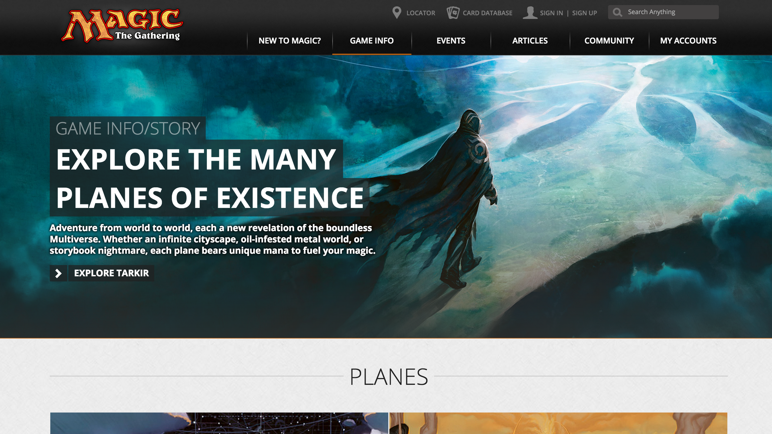
Initially, I identified a few content commonalities that seemed promising as a basis for a navigational structure. My recommendations centered around task-centric hubs and included Game, Story, Products, Events and Articles, in addition to some other utilities like our card database, account access, and term searches. In the end, marketing leadership identified an opportunity to merge key consumerist sections, making room for dedicated new player and community pages.


For all sizes
One element of providing an improved experience was moving from a static layout desktop site to a mobile-friendly responsive layout. While we settled somewhere between responsive and adaptive, the result is a site that works well and is intentionally designed to behave predictably on phones, tablets, and personal computers of many varieties.

Ongoing improvements
Behind the scenes of many of our refreshed brand sites, Drupal is providing a foundation for iterative improvement. Using an open platform has provided a more diverse pool of vendors and a wider range of accessible technologies. While getting the front-end dialed in has had it’s challenges, it’s been good to be able to lean on a stable backend.
While we engaged numerous teams & several vendors during this exhaustive undertaking, I served as the internal UX lead during this entire project, taking on any roles necessary.
UX Direction & Vendor UX Management
Vision Synthesis and Documentation
Wireframing
Work Queue Prioritization
Secondary Visual Design oversight
Search Bias Refinement (prior system)
User Story Refinement
User Testing Definition & Review